Typography
Documentation and examples for Tailwind typography, including global settings, headings, body text, lists, and more.
Headings
All HTML headings, <h1> through <h6>, are available.
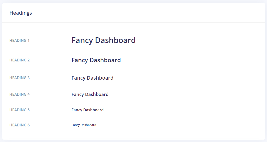
<h1>Argon Dashboard</h1>
<h2>Argon Dashboard</h2>
<h3>Argon Dashboard</h3>
<h4>Argon Dashboard</h4>
<h5>Argon Dashboard</h5>
<h6>Argon Dashboard</h6>
.h1 through .h6 classes are also available, for when you want to match the font styling of a heading but cannot use the associated HTML element.
<p class="h1">Argon Dashboard</p>
<p class="h2">Argon Dashboard</p>
<p class="h3">Argon Dashboard</p>
<p class="h4">Argon Dashboard</p>
<p class="h5">Argon Dashboard</p>
<p class="h6">Argon Dashboard</p>
Customizing headings
Use the .text-muted class to customize the color. Or you can create a new class in scss to overwrite.

<h3 class="text-muted">
According to the National Oceanic and Atmospheric Administration, Ted, Scambos, NSIDClead scentist, puts the potentially record maximum.
</h3>
Display headings
Traditional heading elements are designed to work best in the meat of your page content. When you need a heading to stand out, consider using a display heading— a larger, slightly more opinionated heading style.
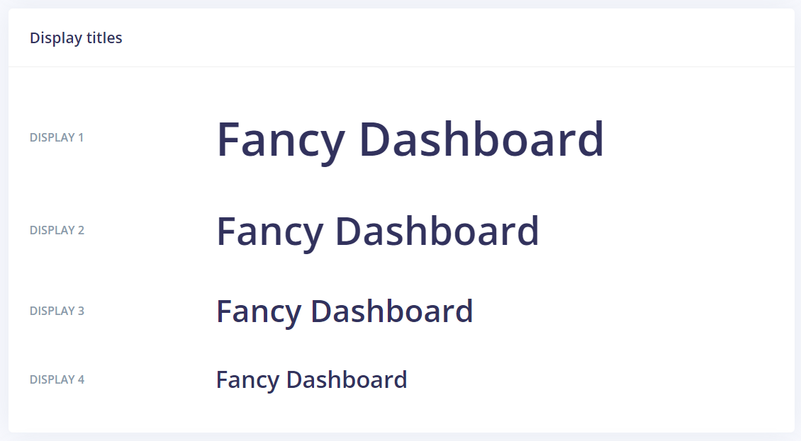
<h1 class="display-1">Display 1</h1>
<h1 class="display-2">Display 2</h1>
<h1 class="display-3">Display 3</h1>
<h1 class="display-4">Display 4</h1>
Lead
Make a paragraph stand out by adding .lead.

<p class="lead text-muted"> According to the National Oceanic and Atmospheric Administration, Ted, Scambos, NSIDClead scentist, puts the potentially record maximum.
</p>
Inline text elements
Styling for common inline HTML5 elements.
<p>
  You can use the mark tag to <mark>highlight</mark>
  text.
</p>
<p>
  <del>This line of text is meant to be treated as deleted text.</del>
</p>
<p>
  <s>
    This line of text is meant to be treated as no longer accurate.
  </s>
</p>
<p>
  <ins>
    This line of text is meant to be treated as an addition to the
    document.
  </ins>
</p>
<p>
  <u>This line of text will render as underlined</u>
</p>
<p>
  <small>
    This line of text is meant to be treated as fine print.
  </small>
</p>
<p>
  <strong>This line rendered as bold text.</strong>
</p>
<p>
  <em>This line rendered as italicized text.</em>
</p>
.mark and .small classes are also available to apply the same styles as <mark>and <small>while avoiding any unwanted semantic implications that the tags would bring.
While not shown above, feel free to use <b>and <i>in HTML5. <b>is meant to highlight words or phrases without conveying additional importance while <i>is mostly for voice, technical terms, etc.
Abbreviations
Stylized implementation of HTML’s <abbr>element for abbreviations and acronyms to show the expanded version on hover. Abbreviations have a default underline and gain a help cursor to provide additional context on hover and to users of assistive technologies.
Add .initialism to an abbreviation for a slightly smaller font-size.
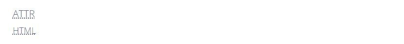
<p>
  <abbr title="attribute">attr</abbr>
</p>
<p>
  <abbr class="initialism" title="HyperText Markup Language">
    HTML
  </abbr>
</p>
Blockquotes
For quoting blocks of content from another source within your document. Wrap <blockquote class="blockquote"> around any HTMLas the quote.
Add a <footer class="blockquote-footer"> for identifying the source. Wrap the name of the source work in <cite>.
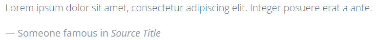
<blockquote class="blockquote">
  <p>
    Lorem ipsum dolor sit amet, consectetur adipiscing elit. Integer posuere erat a ante.
  </p>
  <footer class="blockquote-footer">
    <div class="before:content-['\2014\A0'] inline-block mr-1">Someone famous in</div>
    <cite title="Source Title">Source Title</cite>
  </footer>
</blockquote>
Alignment
Use text utilities as needed to change the alignment of your blockquote.

<blockquote class="blockquote text-center">
  <p>
    Lorem ipsum dolor sit amet, consectetur adipiscing elit. Integer posuere erat a ante.
  </p>
  <footer class="blockquote-footer">
    <div class="before:content-['\2014\A0'] inline-block mr-1">Someone famous in</div>
    <cite title="Source Title">Source Title</cite>
  </footer>
</blockquote>

<blockquote class="blockquote text-right">
  <p>
    Lorem ipsum dolor sit amet, consectetur adipiscing elit. Integer posuere erat a ante.
  </p>
  <footer class="blockquote-footer">
    <div class="before:content-['\2014\A0'] inline-block mr-1">Someone famous in</div>
    <cite title="Source Title">Source Title</cite>
  </footer>
</blockquote>
Lists
Unstyled
Remove the default list-style and left margin on list items (immediate children only). This only applies to immediate child list items, meaning you will need to add the class for any nested lists as well.
<ul class="list-unstyled">
  <li>Lorem ipsum dolor sit amet</li>
  <li>Consectetur adipiscing elit</li>
  <li>Integer molestie lorem at massa</li>
  <li>Facilisis in pretium nisl aliquet</li>
  <li>
    Nulla volutpat aliquam velit{" "}
    <ul>
      <li>Phasellus iaculis neque</li>
      <li>Purus sodales ultricies</li>
      <li>Vestibulum laoreet porttitor sem</li>
      <li>Ac tristique libero volutpat at</li>
    </ul>
  </li>
  <li>Faucibus porta lacus fringilla vel</li>
  <li>Aenean sit amet erat nunc</li>
  <li>Eget porttitor lorem</li>
</ul>
Inline
Remove a list’s bullets and apply some light margin with a combination of two classes, .list-inline and .list-inline-item.

<ul class="list-inline">
  <li class="list-inline-item">Lorem ipsum</li>
  <li class="list-inline-item">Phasellus iaculis</li>
  <li class="list-inline-item">Nulla volutpat</li>
</ul>
Description list alignment
Align terms and descriptions horizontally by using our grid system’s predefined classes (or semantic mixins). For longer terms, you can optionally add a text-truncate class to truncate the text with an ellipsis.
<div class="truncate">
  Truncated term is truncated
</div>
Responsive typography
Responsive typography refers to scaling text and components by simply adjusting the root element’s font-size within a series of media queries. Bootstrap doesn’t do this for you, but it’s fairly easy to add if you need it.
Here’s an example of it in practice. Choose whatever font-sizes and media queries you wish.
// Default & mobiles
html {
  @apply font-base; //font-size: 1rem
}

// Tablets with font-size: 1.25 rem
html {
  @apply font-base md:font-xl;
}

// Larger devices with font-size: 1.5 rem
html {
  @apply font-base lg:font-xl md:font-2xl;
}