Buttons
Use TailwindCSS custom button styles for actions in forms, dialogs, and more with support for multiple sizes, states, and more.
Basic usage
Examples
TailwindCSS includes several predefined button styles, each serving its own semantic purpose, with a few extras thrown in for more control.
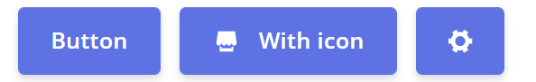
<div>
  <el-button type="primary">Button</el-button>
  <el-button type="primary">
    <el-icon :size="17" class="mr-3"> <Shop /> </el-icon>
    With icon
  </el-button>
  <el-button type="primary">
    <el-icon :size="17">
      <Tools />
    </el-icon>
  </el-button>
</div>
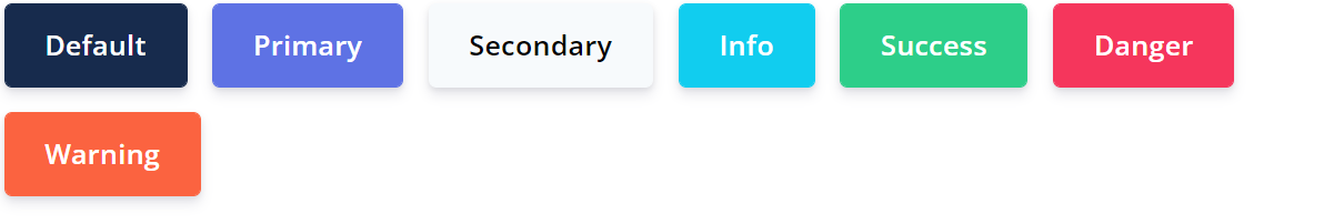
<div>
 <el-button type="default">Default</el-button>
 <el-button type="primary">Primary</el-button>
 <el-button class="el-button--secondary">Secondary</el-button>
 <el-button type="info">Info</el-button>
 <el-button type="success">Success</el-button>
 <el-button type="danger">Danger</el-button>
 <el-button type="warning">Warning</el-button>
</div>
Plain buttons
In need of a button, but not the hefty background colors they bring? Add plain prop together with the button type remove all background images and colors on any button.
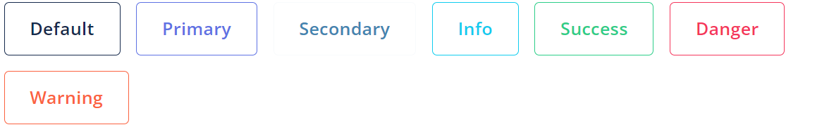
<div>
 <el-button plain type="default">Default</el-button>
 <el-button plain type="primary">Primary</el-button>
 <el-button plain class="el-button--secondary">Secondary</el-button>
 <el-button plain type="info">Info</el-button>
 <el-button plain type="success">Success</el-button>
 <el-button plain type="danger">Danger</el-button>
 <el-button plain type="warning">Warning</el-button>
</div>
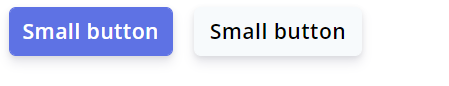
Sizes
Argon larger or smaller buttons? Add size="lg" or size="sm" for additional sizes.
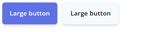
<div>
 <el-button size="lg" type="primary">Primary</el-button>
 <el-button size="lg" class="el-button--secondary">Secondary</el-button>
</div>
<div>
 <el-button size="sm" type="primary">Primary</el-button>
 <el-button size="sm" class="el-button--secondary">Secondary</el-button>
</div>
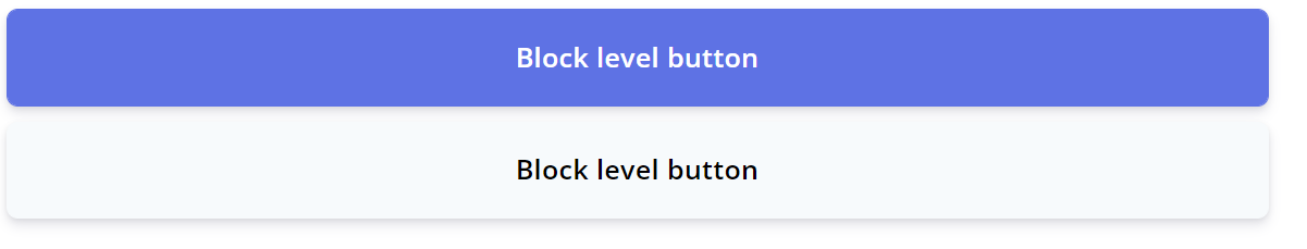
Create block level buttons—those that span the full width of a parent—by adding .w-full class
<div>
 <el-button class="w-full" type="primary">Primary</el-button>
 <el-button class="el-button--secondary w-full">Secondary</el-button>
</div>
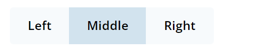
Active state
Buttons will appear pressed (with a darker background, darker border, and inset shadow) when active. There’s no need to add a class to <el-button>s as they use a pseudo-class. However, you can still force the same active appearance with .active (and include the aria-pressed="true" attribute) should you need to replicate the state programmatically.
<div>
<el-button-group>
<el-button class="el-button--secondary">Left</el-button>
<el-button class="el-button--secondary active">Middle</el-button>
<el-button class="el-button--secondary">Right</el-button>
</el-button-group>
</div>
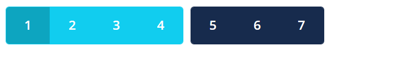
<div>
<el-button-group>
<el-button type="info" class="active">1</el-button>
<el-button type="info">2</el-button>
<el-button type="info">3</el-button>
<el-button type="info">4</el-button>
</el-button-group>
<el-button-group>
<el-button class="btn-default">5</el-button>
<el-button class="btn-default">6</el-button>
<el-button class="btn-default">7</el-button>
</el-button-group>
</div>
Tips and tricks
Social media buttons
Use icons to add more meaning to the Button. You can use the icon alone to save some space, or use it with text.
Use the icon attribute to add an icon. You can find the icon list in the Element Plus icon component. Custom icons can be used as well with <font-awesome-icon>.
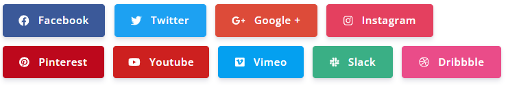
<div>
  <el-button
    class="bg-[#3b5999] border-[#3b5999] active:bg-[#2d4474] active:border-[#2d4474] text-white"
  >
    <font-awesome-icon :icon="['fab', 'facebook']" />
    Facebook
  </el-button>
  <el-button
    class="bg-[#1da1f2] border-[#1da1f2] active:bg-[#33aaf3] active:border-[#33aaf3] text-white"
  >
    <font-awesome-icon :icon="['fab', 'twitter']" />
    Twitter
  </el-button>
  <el-button
    class="bg-[#dd4b39] border-[#dd4b39] active:bg-[#e05d4c] active:border-[#e05d4c] text-white"
  >
    <font-awesome-icon :icon="['fab', 'google-plus-g']" />
    Google +
  </el-button>
  <el-button
    class="bg-[#e4405f] border-[#e4405f] active:bg-[#e6536f] active:border-[#e6536f] text-white"
  >
    <font-awesome-icon :icon="['fab', 'instagram']" />
    Instagram
  </el-button>
  <el-button
    class="bg-[#bd081c] border-[#bd081c] active:bg-[#db0920] active:border-[#db0920] text-white"
  >
    <font-awesome-icon :icon="['fab', 'pinterest']" />
    Pinterest
  </el-button>
  <el-button
    class="bg-[#cd201f] border-[#cd201f] active:bg-[#de2928] active:border-[#de2928] text-white px-3.5"
  >
    <font-awesome-icon :icon="['fab', 'youtube']" />
    Youtube
  </el-button>
  <el-button
    class="bg-[#04a0f0] border-[#04a0f0] active:bg-[#13acfb] active:border-[#13acfb] text-white "
  >
    <font-awesome-icon :icon="['fab', 'vimeo']" />
    Vimeo
  </el-button>
  <el-button
    class="bg-[#3aaf85] border-[#3aaf85] active:bg-[#43c094] active:border-[#43c094] text-white "
  >
    <font-awesome-icon :icon="['fab', 'slack']" />
    Slack
  </el-button>
  <el-button
    class="bg-[#ea4c89] border-[#ea4c89] active:bg-[#ec5d94] active:border-[#ec5d94] text-white "
  >
    <font-awesome-icon :icon="['fab', 'dribbble']" />
    Dribbble
  </el-button>
</div>

<div>
  <el-button
    class="bg-[#3b5999] border-[#3b5999] active:bg-[#2d4474] active:border-[#2d4474] text-white w-9 h-9"
  >
    <font-awesome-icon :icon="['fab', 'facebook']" />
  </el-button>
  <el-button
    class="bg-[#1da1f2] border-[#1da1f2] active:bg-[#33aaf3] active:border-[#33aaf3] text-white w-9 h-9"
  >
    <font-awesome-icon :icon="['fab', 'twitter']" />
  </el-button>
  <el-button
    class="bg-[#dd4b39] border-[#dd4b39] active:bg-[#e05d4c] active:border-[#e05d4c] text-white w-9 h-9"
  >
    <font-awesome-icon :icon="['fab', 'google-plus-g']" />
  </el-button>
  <el-button
    class="bg-[#e4405f] border-[#e4405f] active:bg-[#e6536f] active:border-[#e6536f] text-white w-9 h-9"
  >
    <font-awesome-icon :icon="['fab', 'instagram']" />
  </el-button>
  <el-button
    class="bg-[#bd081c] border-[#bd081c] active:bg-[#db0920] active:border-[#db0920] text-white w-9 h-9"
  >
    <font-awesome-icon :icon="['fab', 'pinterest']" />
  </el-button>
  <el-button
    class="bg-[#cd201f] border-[#cd201f] active:bg-[#de2928] active:border-[#de2928] text-white w-9 h-9"
  >
    <font-awesome-icon :icon="['fab', 'youtube']" />
  </el-button>
  <el-button
    class="bg-[#04a0f0] border-[#04a0f0] active:bg-[#13acfb] active:border-[#13acfb] text-white w-9 h-9"
  >
    <font-awesome-icon :icon="['fab', 'vimeo']" />
  </el-button>
  <el-button
    class="bg-[#3aaf85] border-[#3aaf85] active:bg-[#43c094] active:border-[#43c094] text-white w-9 h-9"
  >
    <font-awesome-icon :icon="['fab', 'slack']" />
  </el-button>
  <el-button
    class="bg-[#ea4c89] border-[#ea4c89] active:bg-[#ec5d94] active:border-[#ec5d94] text-white w-9 h-9"
  >
    <font-awesome-icon :icon="['fab', 'dribbble']" />
  </el-button>
</div>

<div>
  <el-button
    circle
    class="w-9 h-9 bg-[#3b5999] border-[#3b5999] active:bg-[#2d4474] active:border-[#2d4474] text-white"
  >
    <font-awesome-icon :icon="['fab', 'facebook']" />
  </el-button>
  <el-button
    circle
    class="w-9 h-9 bg-[#1da1f2] border-[#1da1f2] active:bg-[#33aaf3] active:border-[#33aaf3] text-white"
  >
    <font-awesome-icon :icon="['fab', 'twitter']" />
  </el-button>
  <el-button
    circle
    class="w-9 h-9 bg-[#dd4b39] border-[#dd4b39] active:bg-[#e05d4c] active:border-[#e05d4c] text-white"
  >
    <font-awesome-icon :icon="['fab', 'google-plus-g']" />
  </el-button>
  <el-button
    circle
    class="w-9 h-9 bg-[#e4405f] border-[#e4405f] active:bg-[#e6536f] active:border-[#e6536f] text-white"
  >
    <font-awesome-icon :icon="['fab', 'instagram']" />
  </el-button>
  <el-button
    circle
    class="w-9 h-9 bg-[#bd081c] border-[#bd081c] active:bg-[#db0920] active:border-[#db0920] text-white"
  >
    <font-awesome-icon :icon="['fab', 'pinterest']" />
  </el-button>
  <el-button
    circle
    class="w-9 h-9 bg-[#cd201f] border-[#cd201f] active:bg-[#de2928] active:border-[#de2928] text-white"
  >
    <font-awesome-icon :icon="['fab', 'youtube']" />
  </el-button>
  <el-button
    circle
    class="w-9 h-9 bg-[#04a0f0] border-[#04a0f0] active:bg-[#13acfb] active:border-[#13acfb] text-white"
  >
    <font-awesome-icon :icon="['fab', 'vimeo']" />
  </el-button>
  <el-button
    circle
    class="w-9 h-9 bg-[#3aaf85] border-[#3aaf85] active:bg-[#43c094] active:border-[#43c094] text-white"
  >
    <font-awesome-icon :icon="['fab', 'slack']" />
  </el-button>
  <el-button
    circle
    class="w-9 h-9 bg-[#ea4c89] border-[#ea4c89] active:bg-[#ec5d94] active:border-[#ec5d94] text-white"
  >
    <font-awesome-icon :icon="['fab', 'dribbble']" />
  </el-button>
</div>
Button Attributes
| Attribute | Description | Type | Accepted Values | Default |
|---|---|---|---|---|
| size | button size | string | large / default /small | — |
| type | button type | string | primary / success / warning / danger / info | — |
| plain | determine whether it's a plain button | boolean | — | false |
| text | determine whether it's a text button | boolean | — | false |
| round | determine whether it's a round button | boolean | — | false |
| circle | determine whether it's a circle button | boolean | — | false |
| icon | icon component | string / Component | — | — |