Grid system
Use our powerful grid system to build layouts of all shapes and sizes thanks to a twelve column system, five default responsive tiers, Sass variables and mixins, and dozens of predefined classes.
How it works
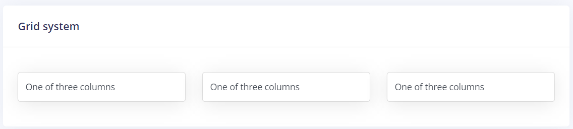
Tailwind's grid system uses a series of containers, rows, and columns to layout and align content. It’s built with flexbox and the grid template is fully responsive. Below is an example and an in-depth look at how the grid comes together.
New to or unfamiliar with flex box? Read this CSS Tricks flex box guide for background, terminology, guidelines, and code snippets.
<div class="grid grid-cols-1 sm:grid-cols-3 gap-7 text-center items-center my-3">
    <div class="grid-items">One of three columns</div>
    <div class="grid-items">One of three columns</div>
    <div class="grid-items">One of three columns</div>
</div>
The above example creates three equal-width columns on small, medium, large, and extra-large devices using our predefined grid classes. Those columns are centered on the page with the parent Container.
For more information and how to use Tailwind's grid. Please visit Grid basic
Basic usage
Specifying the columns in a grid
Use the grid-cols-{n} utilities to create grids with n equally sized columns.
Use the grid-items class to active default css for the layout of column
<div class="grid grid-cols-3 gap-4">
    <div class="grid-items">One of three columns</div>
    <div class="grid-items">One of three columns</div>
    <div class="grid-items">One of three columns</div>
</div>
Breakpoints and media queries
You can also use variant modifiers to target media queries like responsive breakpoints, dark mode, prefers-reduced-motion, and more. For example, use md:grid-cols-6 to apply the grid-cols-6 utility at only to medium screen sizes and above.
<div class="grid grid-cols-1 md:grid-cols-6">
  <!-- ... -->
</div>
Tips and tricks
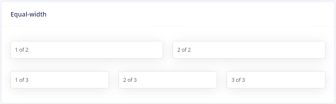
Equal-width
For example, here are two grid layouts that apply to every device and viewport, from mobiles to extra screen devices. Add any number of unit-less classes for each breakpoint you need and every column will be the same width.
<div class="grid grid-cols-6 gap-7 text-center items-center my-3">
    <div class="grid-items col-span-3">1 of 2</div>
    <div class="grid-items col-span-3">2 of 2</div>

    <div class="grid-items col-span-2">1 of 3</div>
    <div class="grid-items col-span-2">2 of 3</div>
    <div class="grid-items col-span-2">3 of 3</div>
</div>
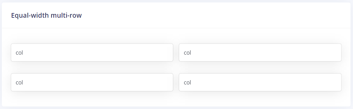
Equal-width multi-row
<div class="flex gap-4 text-center mb-6">
    <div class="grid-items flex-auto">col</div>
    <div class="grid-items flex-auto">col</div>
</div>
<div class="flex gap-4 text-center">
    <div class="grid-items flex-auto">col</div>
    <div class="grid-items flex-auto">col</div>
</div>
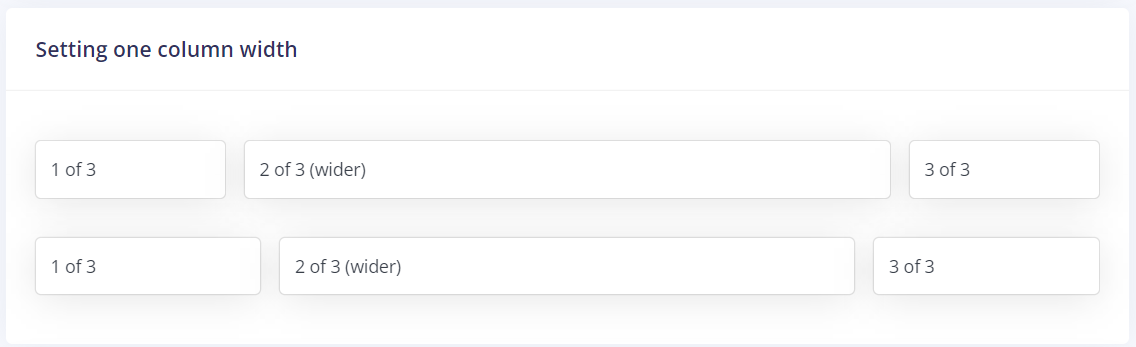
Setting one column width
Auto-layout for flex box grid columns also means you can set the width of one column and have the sibling columns automatically resize around it. You may use predefined grid classes (as shown below), grid mixins, or inline widths. Note that the other columns will resize no matter the width of the center column.
<div class="flex gap-4 text-center mb-6">
    <div class="grid-items flex-auto">1 of 3</div>
    <div class="grid-items flex-auto w-2/4">2 of 3 (wider)</div>
    <div class="grid-items flex-auto">3 of 3</div>
</div>
<div class="flex gap-4 text-center">
    <div class="grid-items flex-auto">1 of 3</div>
    <div class="grid-items flex-auto w-2/5">2 of 3 (wider)</div>
    <div class="grid-items flex-auto">3 of 3</div>
</div>