Tables
Documentation and examples for opt-in styling of tables (given their prevalent use in TypeScript plugins) with TailwindCSS.
Basic usage
Examples
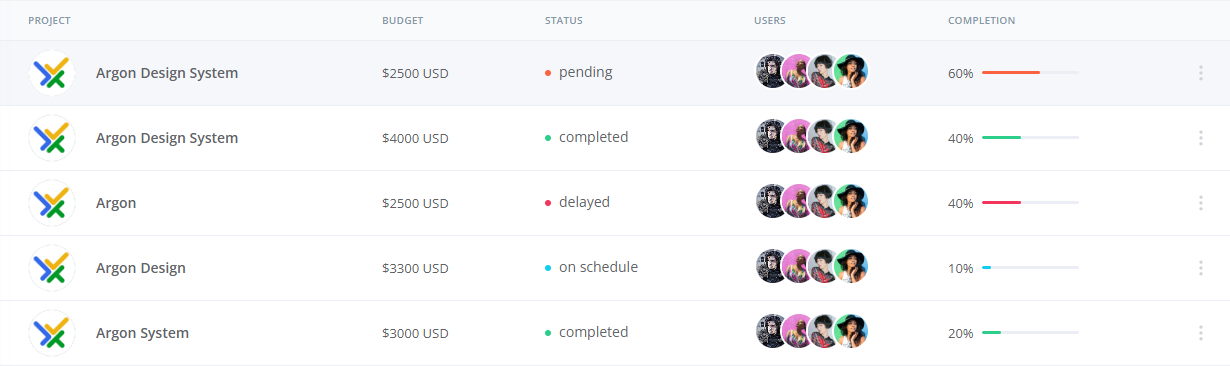
Below is an example of a basic el-table with mixed content.
After setting the attribute data of el-table with an object array, you can use prop (corresponding to a key of the object in the data array) in el-table-column to insert data into table columns, and set the attribute label to define the column name. You can also add a custom class with TailwindCSS to define the table color.
Light Table
<template>
<el-table :data="tableData" style="width: 100%" class="is-light">
  <el-table-column label="PROJECT" min-width="280">
    <template #default="scope">
      <div class="flex items-center">
        <a
          href="#"
          class="inline-flex border border-slate-50 w-12 h-12 rounded-full bg-[#adb5bd] items-center justify-center"
        >
          <el-avatar :size="46" :src="scope.row.projectLogoPath" />
        </a>
        <span class="mb-0 text-0.875 font-semibold cursor-auto">{{
          scope.row.project
        }}</span>
      </div>
    </template>
  </el-table-column>
  <el-table-column label="BUDGET" min-width="115">
    <template #default="scope">
      <div class="px-4 cursor-auto">
        <span class="text-0.8125 font-normal">${{ scope.row.budget }} USD</span>
      </div>
    </template>
  </el-table-column>
  <el-table-column label="STATUS" min-width="167">
    <template #default="scope">
      <div class="px-4 flex items-center">
        <i
          class="w-1.5 h-1.5 rounded-full"
          aria-hidden="true"
          :class="[
            scope.row.status == 'on schedule'
              ? 'bg-info'
              : scope.row.status == 'delayed'
              ? 'bg-danger'
              : scope.row.status == 'pending'
              ? 'bg-warning'
              : 'bg-success',
          ]"
        ></i>
        <span class="ml-2 pb-0.5 text-0.875 font-normal">{{ scope.row.status }}</span>
      </div>
    </template>
  </el-table-column>
  <el-table-column label="USERS" min-width="155">
    <template #default="scope">
      <div class="px-4 flex items-center">
        <div class="flex justify-center -space-x-3">
          <div
            v-for="(value, index) in scope.row.users"
            :key="index"
            class="relative hover:z-10"
            :class="'z-' + index"
          >
            <el-popover
              placement="top"
              :width="10"
              trigger="hover"
              :content="value.name"
              effect="dark"
              popper-class="ava-column-popper"
            >
              <template #reference>
                <el-avatar
                  :size="38"
                  class="cursor-pointer border-[2px] rounded-full border-white"
                  :src="value.avatarPath"
                />
              </template>
            </el-popover>
          </div>
        </div>
      </div>
    </template>
  </el-table-column>
  <el-table-column label="COMPLETION" min-width="200">
    <template #default="scope">
      <div class="px-4 flex flex-row items-center">
        <div>
          <span class="text-0.8125">{{ scope.row.completion }}%</span>
        </div>
        <div class="w-2/4 ml-2">
          <el-progress
            :percentage="scope.row.completion"
            :show-text="false"
            :color="customColorMethod(scope.row.status)"
          />
        </div>
      </div>
    </template>
  </el-table-column>
  <el-table-column width="60" fixed="right">
    <div class="text-center h-12">
      <el-dropdown
        placement="bottom-end"
        trigger="click"
        popper-class="action-column-popper"
      >
        <el-button class="w-5 h-7 border-none el-button--secondary" plain>
          <div class="flex items-center space-x-2 2xl:space-x-4 text-black px-5">
            <DotsVerticalIcon
              class="cursor-pointer h-5 w-5 text-[#ced4da] font-extrabold"
            />
          </div>
        </el-button>
        <template #dropdown>
          <el-dropdown-menu>
            <el-dropdown-item class="mx-0 hover:bg-secondary text-zinc-800">
              <div class="flex items-center w-40 h-6">
                <span class="mb-0 text-sm font-normal">Action</span>
              </div>
            </el-dropdown-item>

            <el-dropdown-item class="mx-0 hover:bg-secondary text-zinc-800">
              <div class="flex items-center w-40 h-6">
                <span class="mb-0 text-sm font-normal">Another Action</span>
              </div>
            </el-dropdown-item>

            <el-dropdown-item class="mx-0 hover:bg-secondary text-zinc-800">
              <div class="flex items-center w-40 h-6">
                <span class="mb-0 text-sm font-normal">Something else here</span>
              </div>
            </el-dropdown-item>
          </el-dropdown-menu>
        </template>
      </el-dropdown>
    </div>
  </el-table-column>
</el-table>
</template>

<script lang="ts">
import { defineComponent } from 'vue'
import { DotsVerticalIcon } from '@heroicons/vue/outline'
import John_Snow_Url from '@/assets/images/John_Snow.png'
import BootStrap_Url from '@/assets/images/bootstrap.jpg'
interface User {
  avatarPath: string
  name: string
}
interface Project {
  projectLogoPath: string
  project: string
  budget: string
  status: string
  users: User[]
  completion: number
}
export default defineComponent({
  name: 'Table',
  components: {
    DotsVerticalIcon,
  },
  setup() {
    const usersData: User[] = [
      {
        avatarPath: John_Snow_Url,
        name: 'Ryan Tompson',
      },
      {
        avatarPath: John_Snow_Url,
        name: 'Romina Hadid',
      },
      {
        avatarPath: John_Snow_Url,
        name: 'Alexander Smith',
      },
      {
        avatarPath: John_Snow_Url,
        name: 'Jessica Doe',
      },
    ]
    const tableData: Project[] = [
      {
        projectLogoPath: BootStrap_Url,
        project: 'Argon Design System',
        budget: '2500 ',
        status: 'pending',
        users: usersData,
        completion: 60,
      },
      {
        projectLogoPath: BootStrap_Url,
        project: 'Argon Design System',
        budget: '4000 ',
        status: 'completed',
        users: usersData,
        completion: 40,
      },
      {
        projectLogoPath: BootStrap_Url,
        project: 'Argon',
        budget: '2500 ',
        status: 'delayed',
        users: usersData,
        completion: 40,
      },
      {
        projectLogoPath: BootStrap_Url,
        project: 'Argon Design',
        budget: '3300 ',
        status: 'on schedule',
        users: usersData,
        completion: 10,
      },
      {
        projectLogoPath: BootStrap_Url,
        project: 'Argon System',
        budget: '3000 ',
        status: 'completed',
        users: usersData,
        completion: 20,
      },
    ]
    const customColorMethod = (status: string) => {
      if (status == 'on schedule') {
        return '#11CDEF'
      } else if (status == 'delayed') {
        return '#F5365C'
      } else if (status == 'pending') {
        return '#FB6340'
      } else {
        return '#2DCE89'
      }
    }
    return { tableData, customColorMethod }
  },
})
</script>
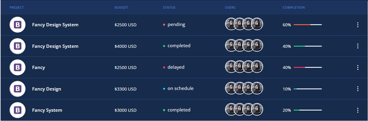
Dark table
Change by using the .is-dark class
<template>
<el-table :data="tableData" style="width: 100%" class="is-dark">
  <el-table-column label="PROJECT" min-width="280">
    <template #default="scope">
      <div class="flex items-center">
        <a
          href="#"
          class="inline-flex border border-slate-50 w-12 h-12 rounded-full bg-[#adb5bd] items-center justify-center"
        >
          <el-avatar :size="46" :src="scope.row.projectLogoPath" />
        </a>
        <span class="mb-0 text-0.875 font-semibold cursor-auto">{{
          scope.row.project
        }}</span>
      </div>
    </template>
  </el-table-column>
  <el-table-column label="BUDGET" min-width="115">
    <template #default="scope">
      <div class="px-4 cursor-auto">
        <span class="text-0.8125 font-normal">${{ scope.row.budget }} USD</span>
      </div>
    </template>
  </el-table-column>
  <el-table-column label="STATUS" min-width="167">
    <template #default="scope">
      <div class="px-4 flex items-center">
        <i
          class="w-1.5 h-1.5 rounded-full"
          aria-hidden="true"
          :class="[
            scope.row.status == 'on schedule'
              ? 'bg-info'
              : scope.row.status == 'delayed'
              ? 'bg-danger'
              : scope.row.status == 'pending'
              ? 'bg-warning'
              : 'bg-success',
          ]"
        ></i>
        <span class="ml-2 pb-0.5 text-0.875 font-normal">{{ scope.row.status }}</span>
      </div>
    </template>
  </el-table-column>
  <el-table-column label="USERS" min-width="155">
    <template #default="scope">
      <div class="px-4 flex items-center">
        <div class="flex justify-center -space-x-3">
          <div
            v-for="(value, index) in scope.row.users"
            :key="index"
            class="relative hover:z-10"
            :class="'z-' + index"
          >
            <el-popover
              placement="top"
              :width="10"
              trigger="hover"
              :content="value.name"
              effect="dark"
              popper-class="ava-column-popper"
            >
              <template #reference>
                <el-avatar
                  :size="38"
                  class="cursor-pointer border-[2px] rounded-full border-white"
                  :src="value.avatarPath"
                />
              </template>
            </el-popover>
          </div>
        </div>
      </div>
    </template>
  </el-table-column>
  <el-table-column label="COMPLETION" min-width="200">
    <template #default="scope">
      <div class="px-4 flex flex-row items-center">
        <div>
          <span class="text-0.8125">{{ scope.row.completion }}%</span>
        </div>
        <div class="w-2/4 ml-2">
          <el-progress
            :percentage="scope.row.completion"
            :show-text="false"
            :color="customColorMethod(scope.row.status)"
          />
        </div>
      </div>
    </template>
  </el-table-column>
  <el-table-column width="60" fixed="right">
    <div class="text-center h-12">
      <el-dropdown
        placement="bottom-end"
        trigger="click"
        popper-class="action-column-popper"
      >
        <el-button class="w-5 h-7 border-none el-button--secondary" plain>
          <div class="flex items-center space-x-2 2xl:space-x-4 text-black px-5">
            <DotsVerticalIcon
              class="cursor-pointer h-5 w-5 text-[#ced4da] font-extrabold"
            />
          </div>
        </el-button>
        <template #dropdown>
          <el-dropdown-menu>
            <el-dropdown-item class="mx-0 hover:bg-secondary text-zinc-800">
              <div class="flex items-center w-40 h-6">
                <span class="mb-0 text-sm font-normal">Action</span>
              </div>
            </el-dropdown-item>

            <el-dropdown-item class="mx-0 hover:bg-secondary text-zinc-800">
              <div class="flex items-center w-40 h-6">
                <span class="mb-0 text-sm font-normal">Another Action</span>
              </div>
            </el-dropdown-item>

            <el-dropdown-item class="mx-0 hover:bg-secondary text-zinc-800">
              <div class="flex items-center w-40 h-6">
                <span class="mb-0 text-sm font-normal">Something else here</span>
              </div>
            </el-dropdown-item>
          </el-dropdown-menu>
        </template>
      </el-dropdown>
    </div>
  </el-table-column>
</el-table>
</template>

<script lang="ts">
import { defineComponent } from 'vue'
import { DotsVerticalIcon } from '@heroicons/vue/outline'
import John_Snow_Url from '@/assets/images/John_Snow.png'
import BootStrap_Url from '@/assets/images/bootstrap.jpg'
interface User {
  avatarPath: string
  name: string
}
interface Project {
  projectLogoPath: string
  project: string
  budget: string
  status: string
  users: User[]
  completion: number
}
export default defineComponent({
  name: 'Table',
  components: {
    DotsVerticalIcon,
  },
  setup() {
    const usersData: User[] = [
      {
        avatarPath: John_Snow_Url,
        name: 'Ryan Tompson',
      },
      {
        avatarPath: John_Snow_Url,
        name: 'Romina Hadid',
      },
      {
        avatarPath: John_Snow_Url,
        name: 'Alexander Smith',
      },
      {
        avatarPath: John_Snow_Url,
        name: 'Jessica Doe',
      },
    ]
    const tableData: Project[] = [
      {
        projectLogoPath: BootStrap_Url,
        project: 'Argon Design System',
        budget: '2500 ',
        status: 'pending',
        users: usersData,
        completion: 60,
      },
      {
        projectLogoPath: BootStrap_Url,
        project: 'Argon Design System',
        budget: '4000 ',
        status: 'completed',
        users: usersData,
        completion: 40,
      },
      {
        projectLogoPath: BootStrap_Url,
        project: 'Argon',
        budget: '2500 ',
        status: 'delayed',
        users: usersData,
        completion: 40,
      },
      {
        projectLogoPath: BootStrap_Url,
        project: 'Argon Design',
        budget: '3300 ',
        status: 'on schedule',
        users: usersData,
        completion: 10,
      },
      {
        projectLogoPath: BootStrap_Url,
        project: 'Argon System',
        budget: '3000 ',
        status: 'completed',
        users: usersData,
        completion: 20,
      },
    ]
    const customColorMethod = (status: string) => {
      if (status == 'on schedule') {
        return '#11CDEF'
      } else if (status == 'delayed') {
        return '#F5365C'
      } else if (status == 'pending') {
        return '#FB6340'
      } else {
        return '#2DCE89'
      }
    }
    return { tableData, customColorMethod }
  },
})
</script>