Notifications
This document is all about different kinds of pop-up layouts. Provide contextual feedback messages for typical user actions with a handful of available and flexible alert messages.
The pop-up notifications are built with el-dialog to display the information that you want when a user clicks on a specified button.
Alerts
Alerts was built with <el-alert></el-alert> in Element-plus library to display important message.
Basic usage
Alert components are non-overlay elements in the page that do not disappear automatically.
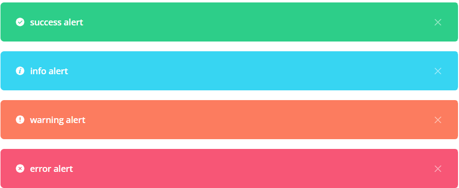
Alert provides 4 types of themes defined by type, whose default value is info.
<template>
    <el-card class="mb-7.5 border-none">
        <template #header>
            <h3 class="cursor-auto mb-0 text-card-title">Alerts</h3>
        </template>
        <div class="flex flex-col gap-4">
            <el-alert class="success" title="success alert" type="success" show-icon />
            <el-alert class="info" title="info alert" type="info" show-icon />
            <el-alert class="warning" title="warning alert" type="warning" show-icon />
            <el-alert class="danger" title="error alert" type="error" show-icon />
        </div>
    </el-card>
</template>

<script lang="ts">
// Import Message Alert Library
import { Message } from 'element-plus'

// Import Icon Library
import { ThumbUpIcon } from '@heroicons/vue/solid'

export default defineComponent({
    components: {
        ThumbUpIcon,
    },
})

</script>
Without dismissing icon
To remove dismissing icon, just remove show-icon attribute.

<el-alert class="success" title="success alert" type="success" />
Types of alert
We defined 4 types of alerts such as: success, info, danger and warming. In which, they are got default colors. You can use default or customize that with sass to overwrite the default colors.
Use class=[class name] & type=[type name] to define which one will you use
Alert success

<el-alert class="success" title="success alert" type="success" show-icon />
Alert info

<el-alert class="info" title="info alert" type="info" show-icon />
Alert warning

<el-alert class="warning" title="warning alert" type="warning" show-icon />
Alert danger

<el-alert class="danger" title="danger alert" type="danger" show-icon />
Modals
Use Element-plus library to add dialogs to your site for light boxes, user notifications, or completely custom content. In this case, we use <el-dialog></el-dialog> to render pop-up for modals default below.
To learn more about El-dialog for customizing, please visit El-dialog documentation
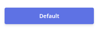
Modals default example
<template>
    <div class="w-full">
        <el-button type="primary" class="w-full" @click="openDefault = true">Default</el-button>
        <el-dialog v-model="openDefault" title="Type your modal title">
            <p>
                Far far away, behind the word mountains, far from the countries Vokalia and
                Consonantia, there live the blind texts. Separated they live in Bookmarksgrove right
                at the coast of the Semantics, a large language ocean.
            </p>
            <br />
            <p>
                A small river named Duden flows by their place and supplies it with the necessary
                regelialia. It is a paradisematic country, in which roasted parts of sentences fly
                into your mouth.
            </p>
            <template #footer>
                <span class="dialog-footer">
                <el-button class="btn-open" type="primary" @click="openDefault = false"
                    >Save changes</el-button
                >
                <el-button class="el-button--secondary" plain @click="openDefault = false"
                    >Close</el-button
                >
                </span>
            </template>
        </el-dialog>
    </div>
</template>

<script lang="ts">

// Import lybrary
import { defineComponent, ref, reactive } from 'vue'

// Import Icon
import { ThumbUpIcon } from '@heroicons/vue/solid'

export default defineComponent({
  setup(_) {

        // Modals - Default
        const openDefault = ref(false)
    }
    return {
      openDefault,
    }
  },
})
</script>
Variations
This is pop-up alert for notifications
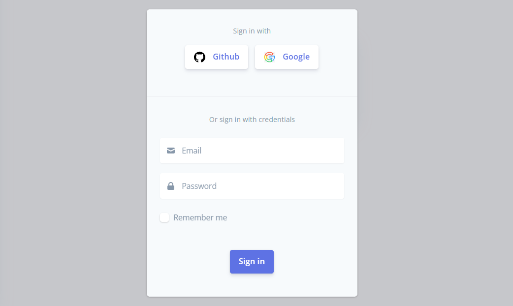
This is pop-up alert for sign-in form
The code below will show all types of modal alerts together
<template>
<el-card class="mb-7.5 border-none">
<template #header>
<h3 class="cursor-auto mb-0 text-card-title">Modals</h3>
</template>
<div class="grid grid-cols-1 gap-4 md:grid-cols-3 md:gap-6 lg:grid-cols-3 lg:gap-6">
<!-- Modals - Default -->
<div class="w-full">
<el-button type="primary" class="w-full" @click="openDefault = true">Default</el-button>
<el-dialog v-model="openDefault" title="Type your modal title">
<p>
Far far away, behind the word mountains, far from the countries Vokalia and
Consonantia, there live the blind texts. Separated they live in Bookmarksgrove right
at the coast of the Semantics, a large language ocean.
</p>
<br />
<p>
A small river named Duden flows by their place and supplies it with the necessary
regelialia. It is a paradisematic country, in which roasted parts of sentences fly
into your mouth.
</p>
<template #footer>
<span class="dialog-footer">
<el-button class="btn-open" type="primary" @click="openDefault = false"
>Save changes</el-button
>
<el-button class="el-button--secondary" plain @click="openDefault = false"
>Close</el-button
>
</span>
</template>
</el-dialog>
</div>
<!-- Modal - Danger -->
<div class="w-full">
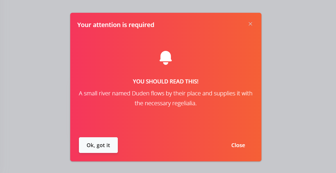
<el-button type="warning" class="w-full" @click="openNotification = true"
>Notification</el-button
>
<el-dialog
v-model="openNotification"
title="Your attention is required"
custom-class="danger"
>
<div class="text-center py-4 text-white break-normal">
<el-icon><BellIcon /></el-icon>
<h4 class="text-white mt-6 mb-2 uppercase break-normal">You should read this!</h4>
<p class="text-white break-normal">
A small river named Duden flows by their place and supplies it with the necessary
regelialia.
</p>
</div>
<template #footer>
<span class="dialog-footer">
<el-button class="el-button--secondary" @click="openNotification = false"
>Ok, got it</el-button
>
<el-button class="btn1-close" type="danger" @click="openNotification = false"
>Close</el-button
>
</span>
</template>
</el-dialog>
</div>
<!-- Modals - Form -->
<div class="w-full">
<el-button type="default" class="w-full" @click="dialogFormVisible = true"
>Form</el-button
>
<el-dialog v-model="dialogFormVisible" custom-class="sign-in">
<div class="w-full pt-5 pb-12 border-b px-6">
<div class="mb-4 mt-2 text-center">
<small class="text-12.8 mb-6">Sign in with</small>
</div>
<div class="flex flex-wrap justify-center gap-0">
<el-button type="primary" class="sign-btn" href="#">
<span><img class="h-5 w-5" src="@/assets/images/github.png" alt="" /></span>
<span class="ml-[14px]">Github</span>
</el-button>
<el-button type="primary" class="sign-btn" href="#">
<span><img class="h-5 w-5" src="@/assets/images/google.png" alt="" /></span>
<span class="ml-[14px]">Google</span>
</el-button>
</div>
</div>
<div class="w-full p-6 xl:p-12">
<div class="mb-4 mt-2 text-center">
<small class="block w-full text-12.8 mb-6">Or sign in with credentials</small>
</div>
<el-form :model="form" class="shadow-form">
<!-- Email -->
<el-form-item class="form-input" prop="MailIcon">
<el-icon>
<component :is="form.MailIcon" />
</el-icon>
<el-input v-model="form.email" placeholder="Email" />
</el-form-item>
<!-- Password -->
<el-form-item class="form-input" prop="LockClosedIcon">
<el-icon>
<component :is="form.LockClosedIcon" />
</el-icon>
<el-input v-model="form.password" placeholder="Password" />
</el-form-item>
<!-- Checkbox -->
<el-form-item class="checkbox">
<el-checkbox v-model="form.type" label="Remember me" name="type" />
</el-form-item>
<!-- Submit -->
<el-form-item>
<el-button type="primary" @click="onSubmit">Sign in</el-button>
</el-form-item>
</el-form>
</div>
</el-dialog>
</div>
</div>
</el-card>
</template>
<script lang="ts">
import { defineComponent, ref, reactive } from 'vue'
import { Message } from 'element-plus'
// Icon
import { BellIcon, MailIcon, LockClosedIcon } from '@heroicons/vue/solid'
export default defineComponent({
name: 'Notification',
components: {
//Import icons
ThumbUpIcon,
BellIcon,
},
setup(_) {
// Modals - Default
const openDefault = ref(false)
// Modals - Notifications
const openNotification = ref(false)
// Modals - Form
const dialogFormVisible = ref(false)
const formLabelWidth = '140px'
const form = reactive({
email: '',
password: '',
type: [],
MailIcon: MailIcon,
LockClosedIcon: LockClosedIcon,
})
const onSubmit = () => {
console.log(dialogFormVisible)
}
return {
openDefault,
openNotification,
dialogFormVisible,
formLabelWidth,
form,
onSubmit,
}
},
})
</script>
Notifications
The pop-up notifications are built with el-dialog to display information that you want when user click on a specified button.
Notifications demo
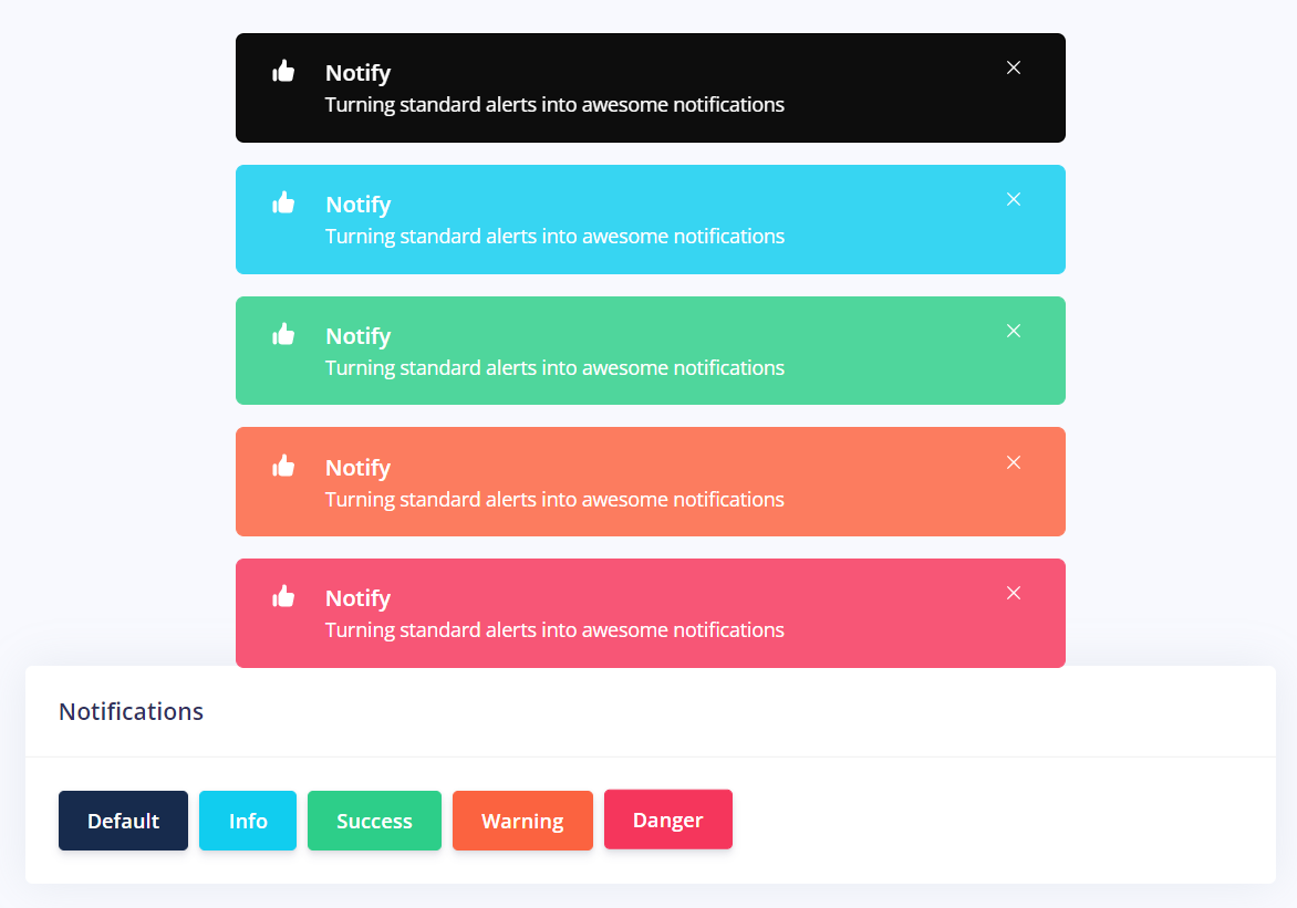
The code below shows all types of notifications
<template>
    <!-- Notifications -->
    <el-card class="mb-7.5 border-none">
      <template #header>
        <h3 class="cursor-auto mb-0 text-card-title">Notifications</h3>
      </template>
      <div class="flex flex-wrap gap-2">
        <div>
          <el-button type="default" @click="openNotifDefault">Default</el-button>
        </div>
        <div>
          <el-button type="info" @click="openNotifInfo">Info</el-button>
        </div>
        <div>
          <el-button type="success" @click="openNotifSuccess">Success</el-button>
        </div>
        <div>
          <el-button type="warning" @click="openNotifWarning">Warning</el-button>
        </div>
        <div>
          <el-button type="danger" @click="openNotifDanger">Danger</el-button>
        </div>
      </div>
    </el-card>
</template>

<script lang="ts">
import { defineComponent, inject, ref, reactive, h } from 'vue'
import { Message } from 'element-plus'

// Import icon
import { ThumbUpIcon } from '@heroicons/vue/solid'

export default defineComponent({
  name: 'Notification',
  components: {
    ThumbUpIcon,
  },
  setup(_) {
    const $message = inject<Message>('$message')

    // Notifications
    const openNotifDefault = () => {
      $message?.success({
        message: h('div', null, [
          h('p', { class: 'message-header' }, ' Notify'),
          h(
            'p',
            { class: 'message-footer' },
            'Turning standard  alerts into awesome notifications',
          ),
        ]),
        showClose: true,
        type: 'success',
        icon: ThumbUpIcon,
        customClass: 'default',
      })
    }

    const openNotifSuccess = () => {
      $message?.success({
        message: h('div', null, [
          h('p', { class: 'message-header' }, ' Notify'),
          h(
            'p',
            { class: 'message-footer' },
            'Turning standard  alerts into awesome notifications',
          ),
        ]),
        showClose: true,
        type: 'success',
        icon: ThumbUpIcon,
        customClass: 'success',
      })
    }

    const openNotifInfo = () => {
      $message?.success({
        message: h('div', null, [
          h('p', { class: 'message-header' }, ' Notify'),
          h(
            'p',
            { class: 'message-footer' },
            'Turning standard  alerts into awesome notifications',
          ),
        ]),
        showClose: true,
        type: 'info',
        icon: ThumbUpIcon,
        customClass: 'info',
      })
    }

    const openNotifWarning = () => {
      $message?.success({
        message: h('div', null, [
          h('p', { class: 'message-header' }, ' Notify'),
          h(
            'p',
            { class: 'message-footer' },
            'Turning standard  alerts into awesome notifications',
          ),
        ]),
        showClose: true,
        type: 'warning',
        icon: ThumbUpIcon,
        customClass: 'warning',
      })
    }

    const openNotifDanger = () => {
      $message?.success({
        message: h('div', null, [
          h('p', { class: 'message-header' }, ' Notify'),
          h(
            'p',
            { class: 'message-footer' },
            'Turning standard  alerts into awesome notifications',
          ),
        ]),
        showClose: true,
        type: 'error',
        icon: ThumbUpIcon,
        customClass: 'danger',
      })
    }

    return {
      openNotifWarning,
      openNotifDefault,
      openNotifSuccess,
      openNotifInfo,
      openNotifDanger,
    }
  },
})
</script>